Note
Go to the end to download the full example code. or to run this example in your browser via Binder
Plotting reliability diagrams
This example illustrates how to visualise the reliability diagram for a binary probabilistic classifier.
# Author: Miquel Perello Nieto <miquel.perellonieto@bristol.ac.uk>
# License: new BSD

print(__doc__)
This example shows different ways to visualise the reliability diagram for a binary classification problem.
First we will generate two synthetic models and some synthetic scores and labels.
import matplotlib.pyplot as plt
import numpy as np
np.random.seed(42)

n_c1 = n_c2 = 500
p = np.concatenate((np.random.beta(2, 5, n_c1),
                    np.random.beta(4, 3, n_c2)
                   ))

y = np.concatenate((np.zeros(n_c1), np.ones(n_c2)))

s1 = 1/(1 + np.exp(-8*(p - 0.5)))
s2 = 1/(1 + np.exp(-3*(p - 0.5)))

plt.scatter(s1, p, label='Model 1')
plt.scatter(s2, p, label='Model 2')
plt.scatter(p, y)
plt.plot([0, 1], [0, 1], 'r--')
plt.xlabel('Model scores')
plt.ylabel('Sample true probability')
plt.grid()
plt.legend()

p = np.vstack((1 - p, p)).T
s1 = np.vstack((1 - s1, s1)).T
s2 = np.vstack((1 - s2, s2)).T
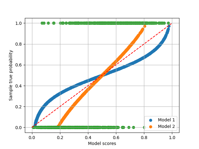
A perfect calibration should be as follows, compared with the generated scores
import scipy.stats as stats

p_g_p = stats.beta.pdf(x=p[:, 1], a=3, b=2)
p_g_n = stats.beta.pdf(x=p[:, 1], a=2, b=7)

p_hat = p_g_p/(p_g_n+p_g_p)
p_hat = np.vstack((1 - p_hat, p_hat)).T

plt.scatter(p[:, 1], s1[:, 1], label='Model 1')
plt.scatter(p[:, 1], s2[:, 1], label='Model 2')
plt.scatter(p[:, 1], p_hat[:, 1], color='red', label='Bayes optimal correction')
plt.xlabel('Sample true probability')
plt.ylabel('Model scores')
plt.grid()
plt.legend()
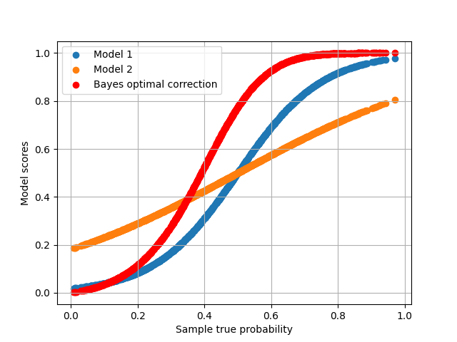
<matplotlib.legend.Legend object at 0x7fd8a0d7de20>
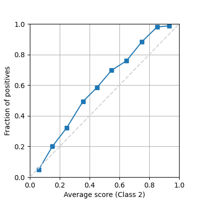
There are at least 2 very common ways to show a reliability diagram for a probabilistic binary classifier. Drawing a line between all the binned mean predictions and the true proportion of positives.
from pycalib.visualisations import plot_reliability_diagram

fig = plot_reliability_diagram(labels=y, scores=s1, show_histogram=False)
And showing bars instead of a lineplot, usually with errorbars showing the discrepancy with respect to a perfectly calibrated model (diagonal)
fig = plot_reliability_diagram(labels=y, scores=s1,
                               class_names=['Negative', 'Positive'],
                               show_gaps=True, show_bars=True,
                               show_histogram=True)
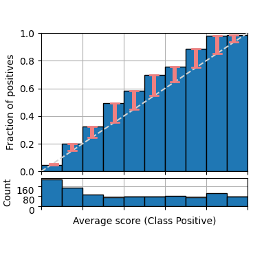
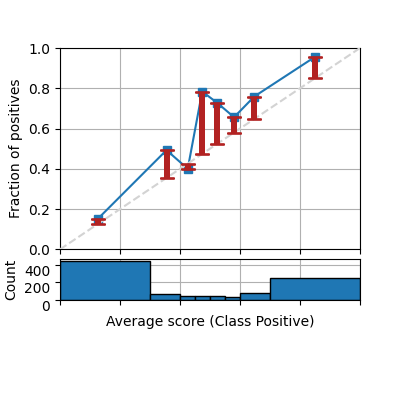
However, both previous illustrations do not include the number of samples that fall into each bin. By default the parameter show_bars is set to True as this information is crucial to understand how reliable is each estimation, and how this affects some of the calibration metrics. We also specify the bin boundaries and change the color of the gaps.
fig = plot_reliability_diagram(labels=y, scores=s1,
                               class_names=['Negative', 'Positive'],
                               show_gaps=True, color_gaps='firebrick',
                               bins=[0, .3, .4, .45, .5, .55, .6, .7, 1])
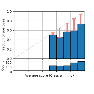
It is also common to plot only the confidence (considering the winning class only as positive class for each prediction). Notice that the class names is automatically set to winning class.
fig = plot_reliability_diagram(labels=y, scores=s1,
                               show_gaps=True,
                               confidence=True,
                               show_bars=True)
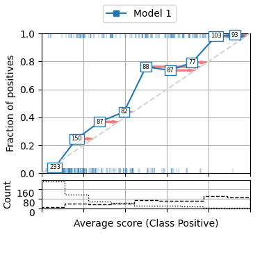
We can enable some parameters to show several aspects of the reliability diagram. For example, we can add a histogram indicating the number of samples on each bin (or show the count in each marker), the correction that should be applied to the average scores in order to calibrate the model can be also shown as red arrows pointing to the direction of the diagonal (perfectly calibrated model). And even the true class of each sample at the y coordinates [0 and 1] for each scored instance (50% of the data in this example, but default is 100%).
fig = plot_reliability_diagram(labels=y, scores=s1,
                               legend=['Model 1'],
                               show_histogram=True,
                               bins=9, class_names=['Negative', 'Positive'],
                               show_counts=True,
                               show_correction=True,
                               sample_proportion=0.5,
                               hist_per_class=True)
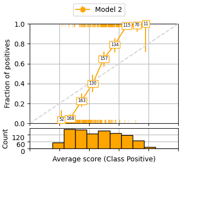
It can be also useful to have 95% confidence intervals for each bin by performing a binomial proportion confidence interval with various statistical tests. This function uses https://www.statsmodels.org/stable/generated/statsmodels.stats.proportion.proportion_confint.html thus accepts the different tests available in the statsmodels library. In the following example we use the Clopper-Pearson interval based on Beta distribution and a confidence interval of 95%.
fig = plot_reliability_diagram(labels=y, scores=s2,
                               legend=['Model 2'],
                               show_histogram=True,
                               show_counts=True,
                               bins=13, class_names=['Negative', 'Positive'],
                               sample_proportion=1.0,
                               errorbar_interval=0.95,
                               interval_method='beta',
                               color_list=['orange'])
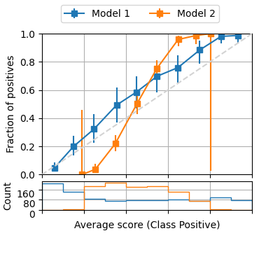
The function also allows the visualisation of multiple models for comparison.
fig = plot_reliability_diagram(labels=y, scores=[s1, s2],
                               legend=['Model 1', 'Model 2'],
                               show_histogram=True,
                               bins=10, class_names=['Negative', 'Positive'],
                               errorbar_interval=0.95,
                               interval_method='beta')
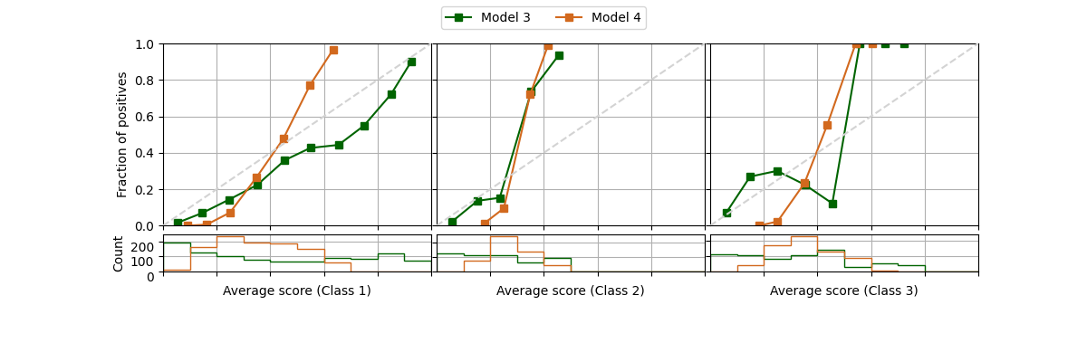
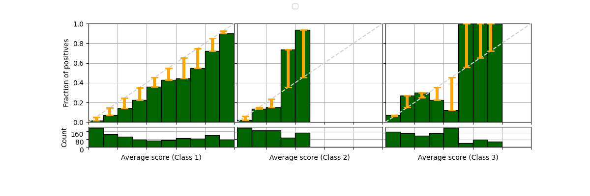
It is possible to draw reliability diagram for multiple classes as well. We will simulate 3 classes by changing some original labels to a 3rd class, and modifying the scores of Model 1 and 2 to create new models 3 and 4.
class_2_idx = range(int(len(y)/3), int(2*len(y)/3))
y[class_2_idx] = 2
s1 = np.hstack((s1, s1[:, 1].reshape(-1, 1)))
s1[class_2_idx,2] *= 3
s1 /= s1.sum(axis=1)[:, None]
s2 = np.hstack((s2, s2[:, 1].reshape(-1, 1)))
s2[class_2_idx,2] *= 2
s2 /= s2.sum(axis=1)[:, None]

fig = plot_reliability_diagram(labels=y, scores=[s1, s2],
                               legend=['Model 3', 'Model 4'],
                               show_histogram=True,
                               color_list=['darkgreen', 'chocolate'])
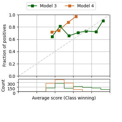
If we are only interested in the confidence, the 3 classes can be visualised in a single reliability diagram
fig = plot_reliability_diagram(labels=y, scores=[s1, s2],
                               legend=['Model 3', 'Model 4'],
                               show_histogram=True,
                               color_list=['darkgreen', 'chocolate'],
                               confidence=True)
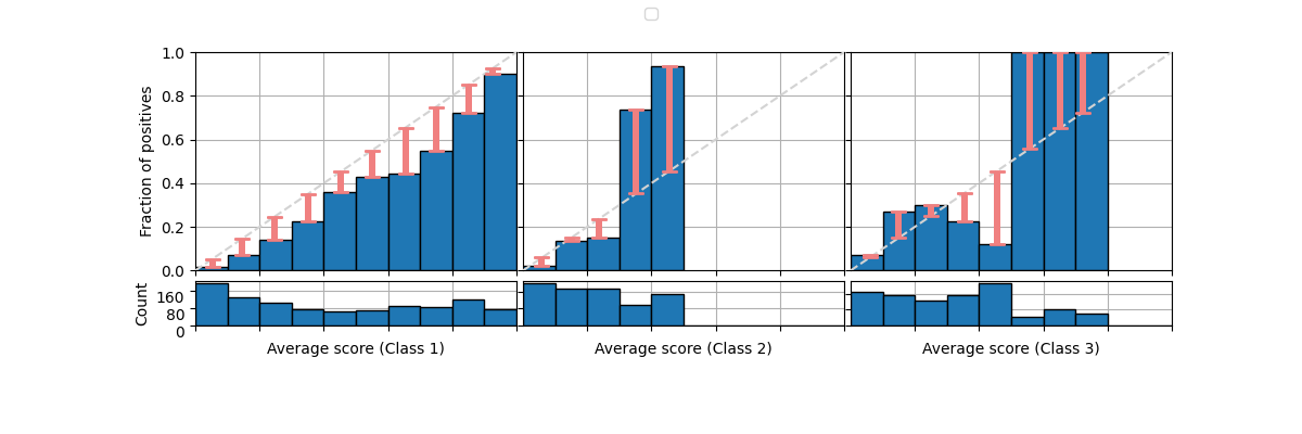
The same can be done with the bars.
fig = plot_reliability_diagram(labels=y, scores=s1,
                               legend=['Model 3'],
                               show_histogram=True,
                               show_bars=True,
                               show_gaps=True)
And change the colors.
fig = plot_reliability_diagram(labels=y, scores=s1,
                               legend=['Model 3'],
                               show_histogram=True,
                               color_list=['darkgreen'],
                               show_bars=True,
                               show_gaps=True,
                               color_gaps='orange')
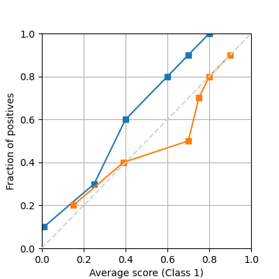
If we have precomputed the average proportion of true positives and predictions, or we have access to the ground truth, it is possible to plot the same reliability diagram using the following function
from pycalib.visualisations import plot_reliability_diagram_precomputed

avg_true = [np.array([.1, .3, .6, .8, .9, 1]).reshape(-1, 1),
            np.array([.2, .4, .5, .7, .8, .9]).reshape(-1, 1)]
avg_pred = [np.array([.01, .25, .4, .6, .7, .8]).reshape(-1, 1),
            np.array([.15, .39, .7, .75, .8, .9]).reshape(-1, 1)]

fig = plot_reliability_diagram_precomputed(avg_true, avg_pred)
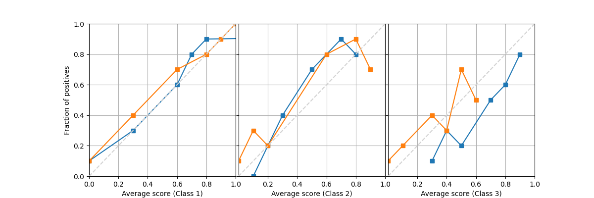
Similarly for a multiclass problem we can provide full matrices of size (n_bins, n_classes) instead. Notice that the order of the predicted scores doesn’t need to be in order, and the probabilities doesn’t need to sum to one among all classes, as the way they are computed may be from different instances.
avg_true = [np.array([[.1, .3, .6, .8, .9, 1.],
                      [.0, .2, .4, .7, .8, .9],
                      [.1, .2, .3, .5, .6, .8]]).T,
            np.array([[.1, .4, .7, .8, .9, 1.],
                      [.9, .3, .8, .2, .7, .1],
                      [.2, .3, .5, .4, .7, .1]]).T]
avg_pred = [np.array([[.0, .3, .6, .7, .8, 9.],
                      [.1, .2, .3, .5, .8, .7],
                      [.3, .5, .4, .7, .8, .9]]).T,
            np.array([[.0, .3, .6, .8, .9, 1.],
                      [.8, .1, .6, .2, .9, 0.],
                      [.1, .4, .6, .3, .5, 0.]]).T]

fig = plot_reliability_diagram_precomputed(avg_true, avg_pred)
Total running time of the script: (0 minutes 2.688 seconds)